 mascofast
Duolingo’s App Experience, Broken Down: 12 Things You Can Steal
Most Duolingo teardowns stop at “streaks, points, and leaderboards.” That is the least interesting layer.
The useful question is what each screen is doing in the user’s journey:
Screenshot → what Duolingo did → why it matters → what another app can steal
The examples below come from Duolingo’s own product articles and product materials. They are not a claim that every learner sees the same flow today. Duolingo says it experiments with different features, messages, and flows, so treat each screen as a documented example with a date and source—not as a universal interface specification.
For a current teardown, record the device, operating system, app version, country, interface language, account state, subscription state, and capture date. That context is part of the evidence.
1. Ask what the user wants before showing the product
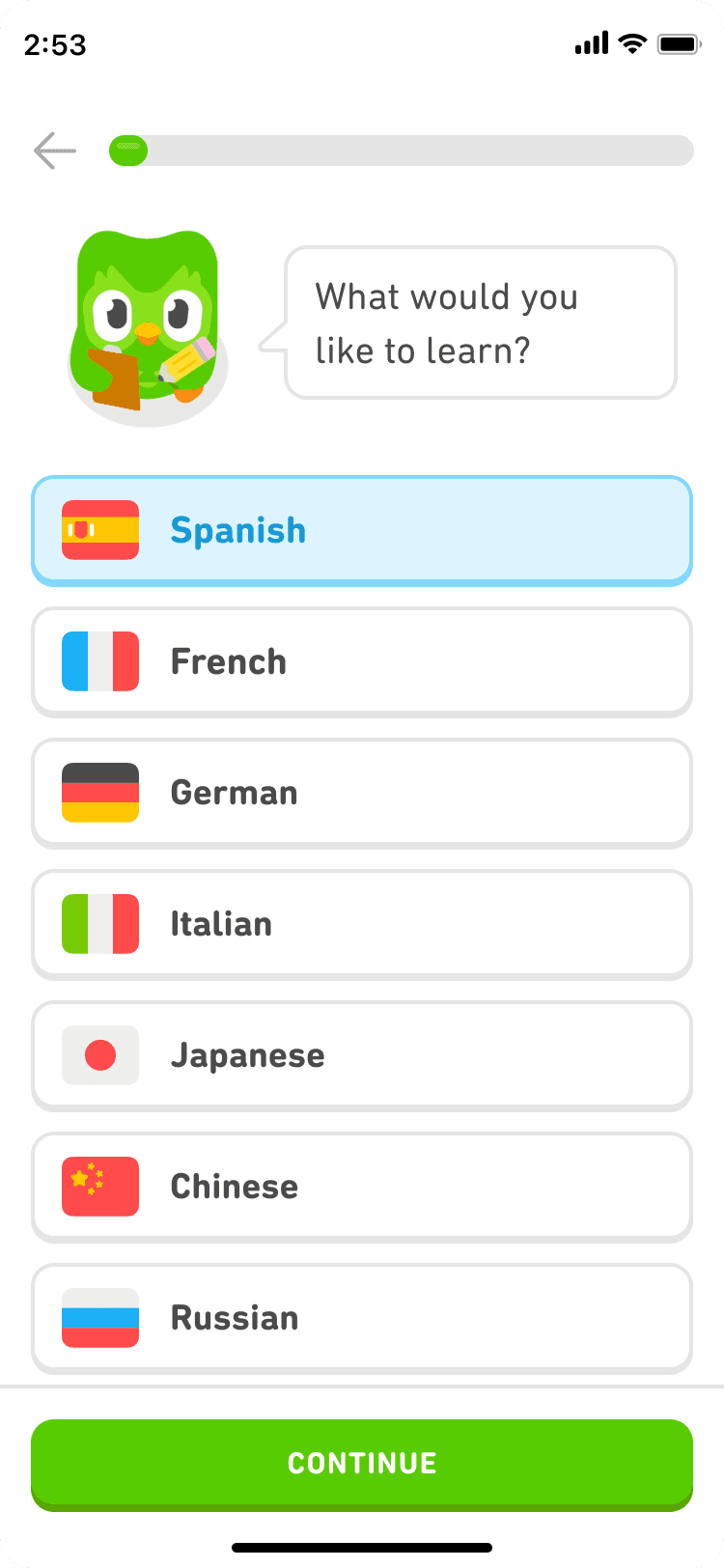
What Duolingo did
The onboarding screen opens with Duo asking, “What would you like to learn?” Language choices are large, visual, and immediately actionable. The page does not begin with a feature inventory or a long explanation of the product.
Why it matters
The first question is doing two jobs: it helps the learner choose a direction, and it gives the product information it can use to shape the next screen. Duolingo’s own onboarding materials describe a flow built around a learner’s goal, language, level, and first lesson.
What you can steal
Start with the outcome the user came for. Then use the answer to configure the first useful action.
For a design tool, ask “What are you making?” and take the user straight to a relevant canvas. For a budgeting app, ask what they want to understand first and show that view—not a tour of every feature.
Don’t copy it blindly
Do not ask for personalization data that does not change the first experience. Every question should earn its place by improving the next action.
2. Let the first lesson teach the interface
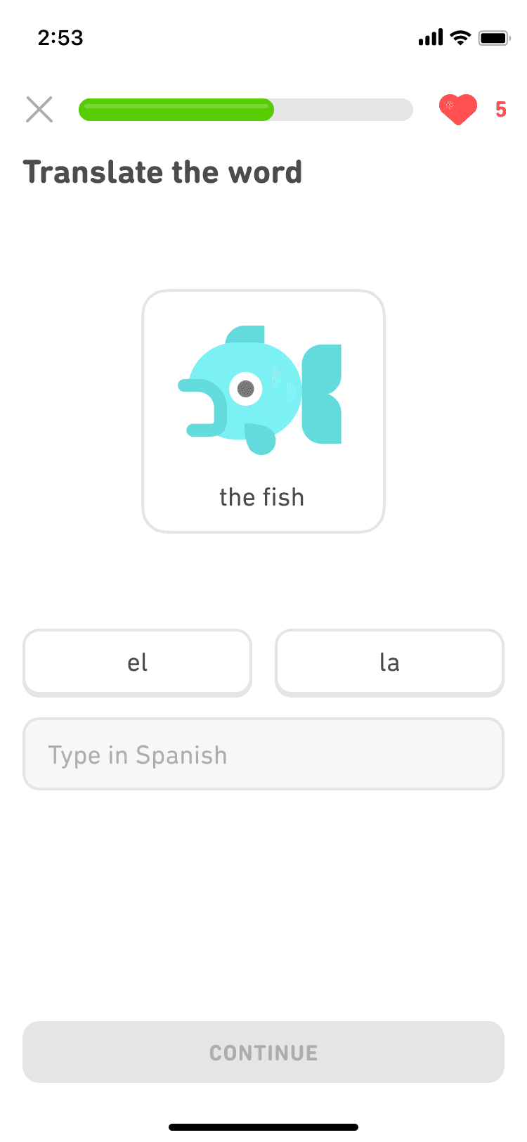
What Duolingo did
The learner encounters a short exercise: read a prompt, choose or build an answer, and continue. The interaction is the onboarding. The user learns what Duolingo is by doing the thing Duolingo exists to help with.
Why it matters
This is a product decision, not merely an onboarding style. A small first task can make the value proposition concrete before the user has learned the product’s vocabulary. The independent teardowns in the research describe this as a recurring pattern in particular Duolingo flows; they do not prove that the pattern alone caused conversion.
What you can steal
Find the smallest credible version of your core job. Let a new user complete that version before asking for optional setup, preferences, or a large commitment.
The design goal is not “delay signup at all costs.” It is “put the commitment after a credible moment of value when the product can safely do so.”
3. Make the next action impossible to miss
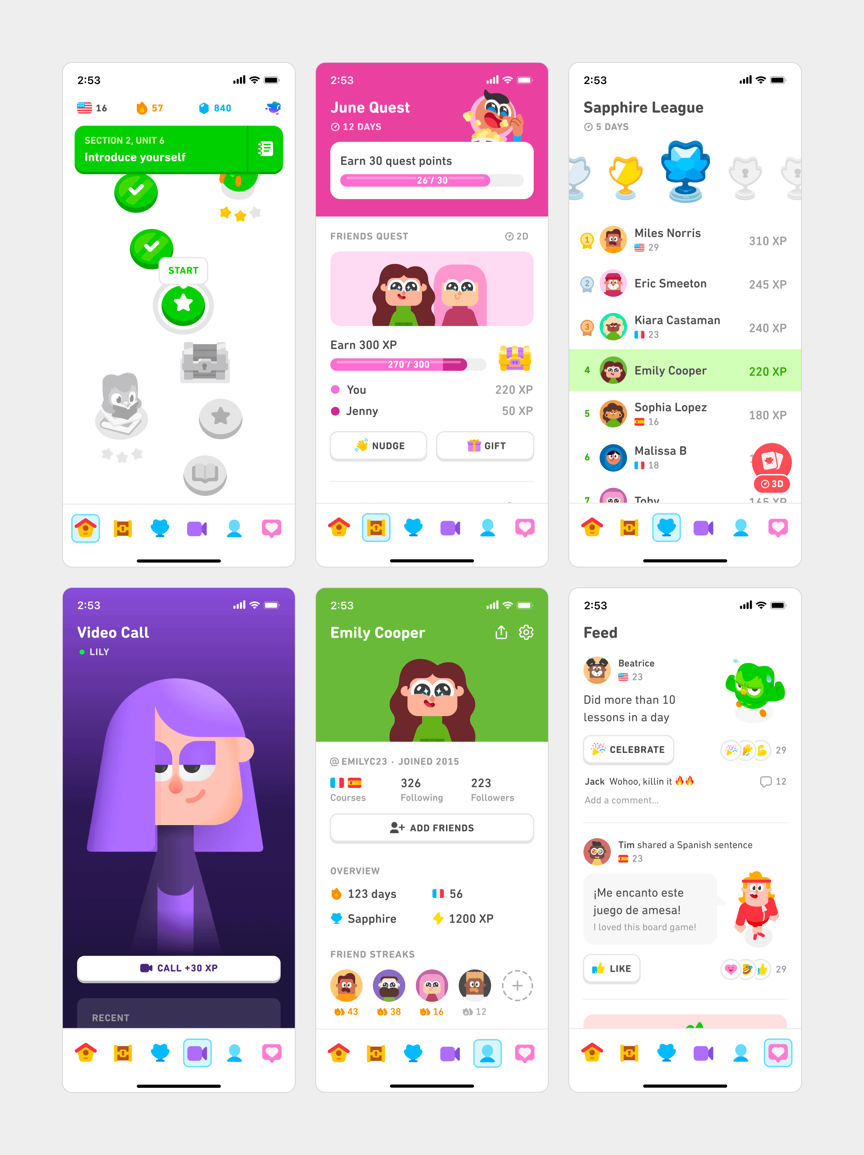
What Duolingo did
In the core-tab redesign, the screens use bold color blocks, large labels, and a persistent bottom navigation row. The home screen gives the learner a clear place to continue; the other tabs group quests, competition, conversations, profile, and feed.
Why it matters
Navigation is not only an information architecture problem. It is a decision-load problem. The learner should not have to reconstruct where to continue every time they open the app.
Duolingo’s redesign post says the team found inconsistency in headers, typography, spacing, and hierarchy across tabs before exploring a more coherent system. That is useful evidence of the problem the redesign addressed, not proof that this exact layout is best for every app.
What you can steal
Give the user one primary continuation path and group secondary actions by job. Make the active location obvious. Use color and position consistently so the interface becomes easier to scan through repetition.
4. Turn a syllabus into a path
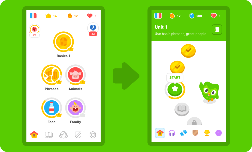
What Duolingo did
The old skill tree and the newer path both contain lessons, but the path presents them as a sequence of smaller steps. Duolingo’s explanation says lessons were ordered, grouped into smaller units, and mixed with practice and stories.
Why it matters
The path answers a question users often have in sequential products: “Am I doing this in the right order?” It reduces the need to make a planning decision before every lesson.
What you can steal
If your product has a meaningful sequence, make the sequence visible. Use milestones that represent real advancement: a completed setup, a shipped stage, a mastered skill, or a finished deliverable.
If there is no meaningful sequence, do not invent a path just to make the home screen look more game-like.
5. Use several clocks for progress
What Duolingo did
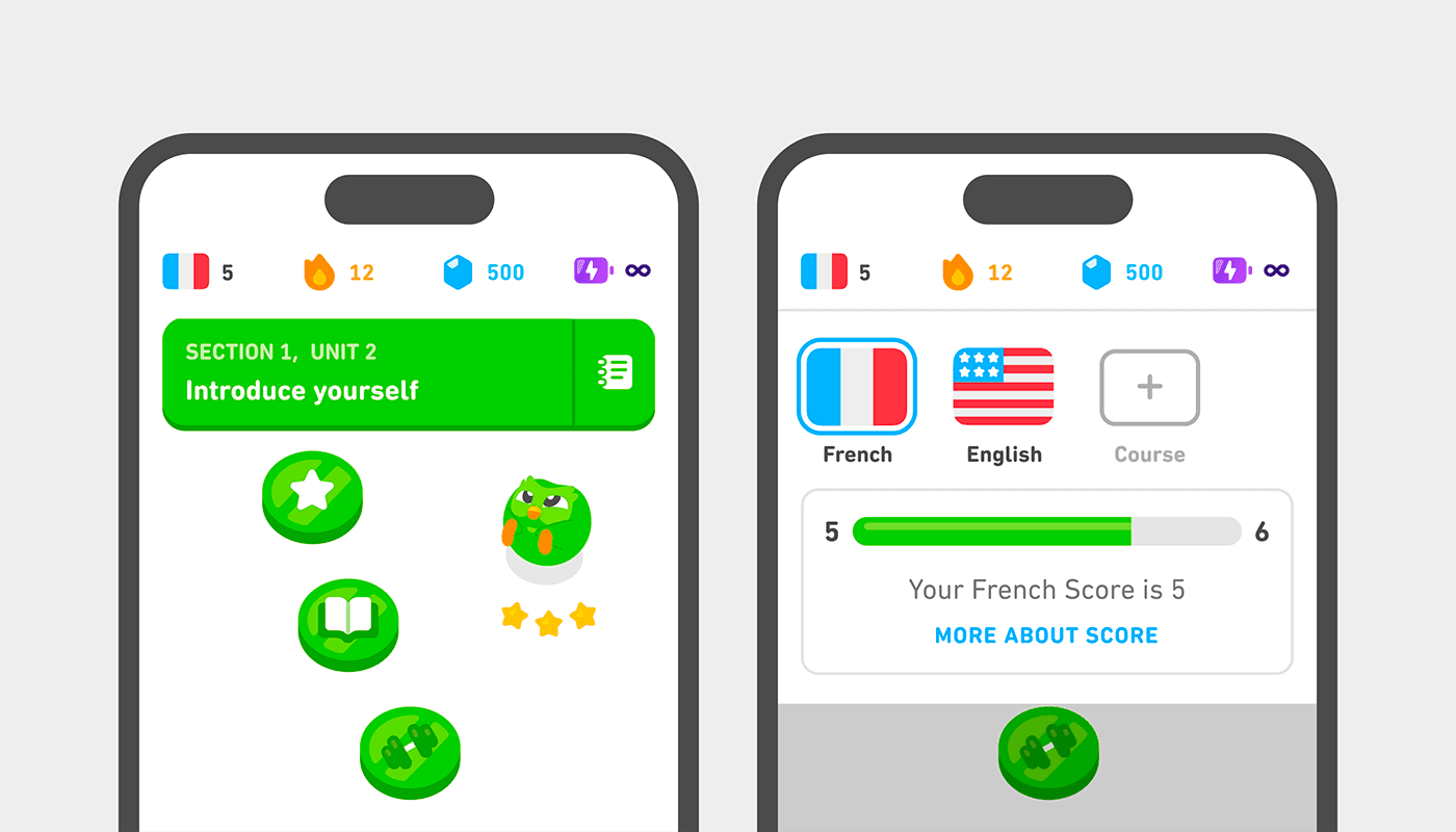
Across its published product examples, Duolingo uses several progress signals: the current exercise result, a completed lesson, a path position, a streak, quests, leagues, achievements, and—more recently—Duolingo Score.
Why it matters
One progress bar cannot answer every question. A learner may need to know whether the current answer was correct, whether today’s practice is done, where they are in a unit, and whether their larger ability is moving forward.
What you can steal
Give each progress signal one job. Write this sentence for every one you add:
“This signal exists to help the user do ______.”
If the answer is only “open the app” or “collect points,” the signal may be measuring activity instead of progress.
6. Make the minimum action smaller than the full goal
What Duolingo did
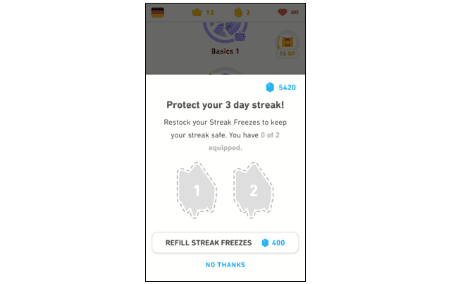
Duolingo separates the action needed to keep continuity from the learner’s larger goal. Its streak materials describe a streak as consecutive days of completed lessons and a Streak Freeze as a way to protect that continuity when a learner needs a day off.
Why it matters
The design distinguishes “keep the routine alive” from “finish the complete plan.” That gives the user a smaller doorway back into the product without pretending that a tiny action equals mastery.
Duolingo has reported historical experiments on streak-extension animation and on separating the minimum streak action from a larger daily goal. Those are company-reported results from specific tests, not universal retention benchmarks.
What you can steal
Define a minimum action that is genuinely useful, then make the full goal visible separately. For a writing app, reviewing one paragraph might preserve continuity while finishing a chapter remains the real milestone.
7. Design recovery, not just failure
What Duolingo did
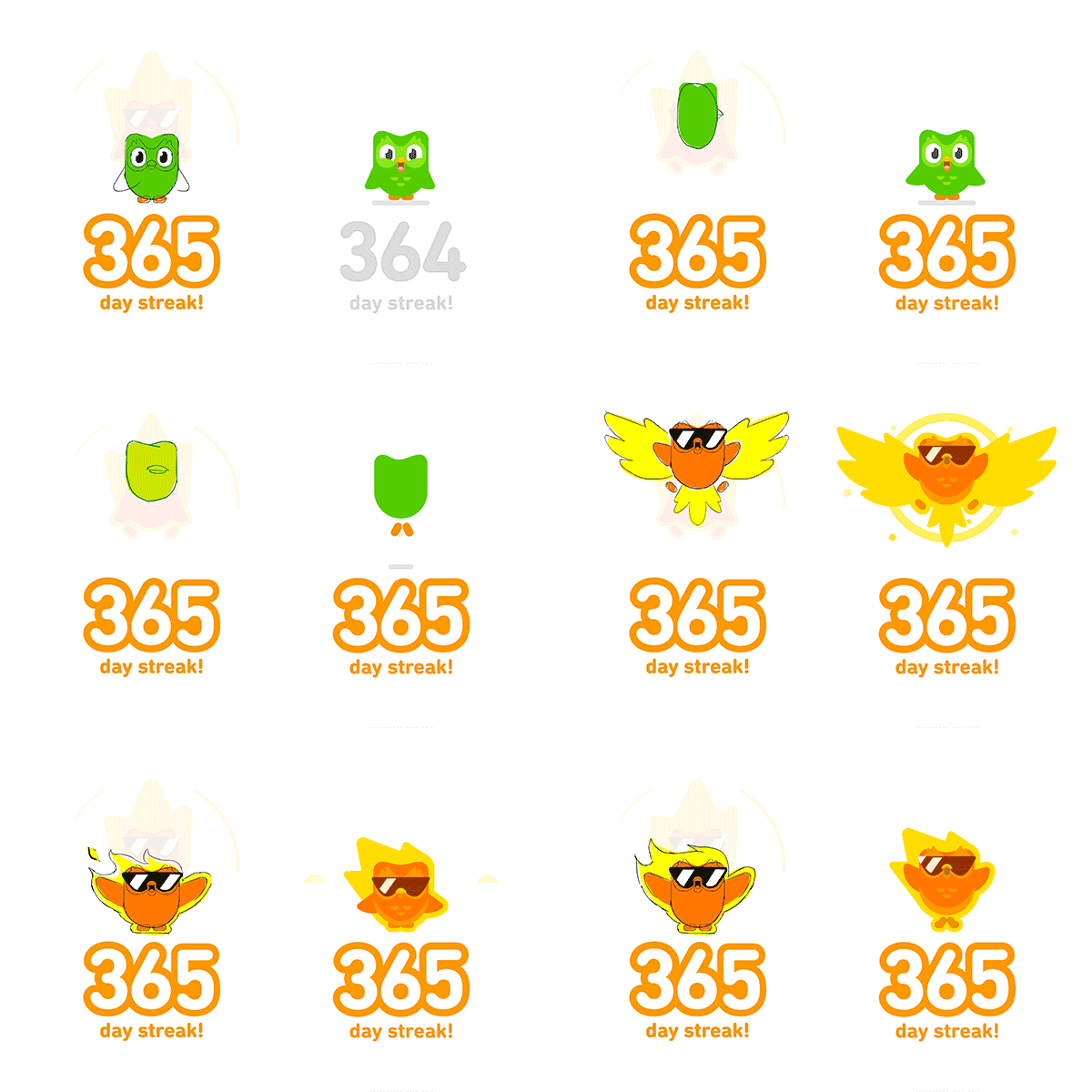
The streak system includes protection and repair concepts rather than treating a missed day as an irreversible dead end. Duolingo’s engineering post also describes repairing streaks after service incidents by using recorded timestamps and filling the affected day.
Why it matters
A system that celebrates consistency but offers no recovery can turn one interruption into abandonment. Recovery is not a reward for cheating; it is a way to distinguish a broken system or an occasional miss from the end of the user’s relationship with the product.
What you can steal
For any continuity mechanic, design the “I missed a day” state before shipping the celebration state. Decide what can be paused, repaired, forgiven, or restarted—and explain the rule plainly.
8. Make feedback legible before making it delightful
What Duolingo did
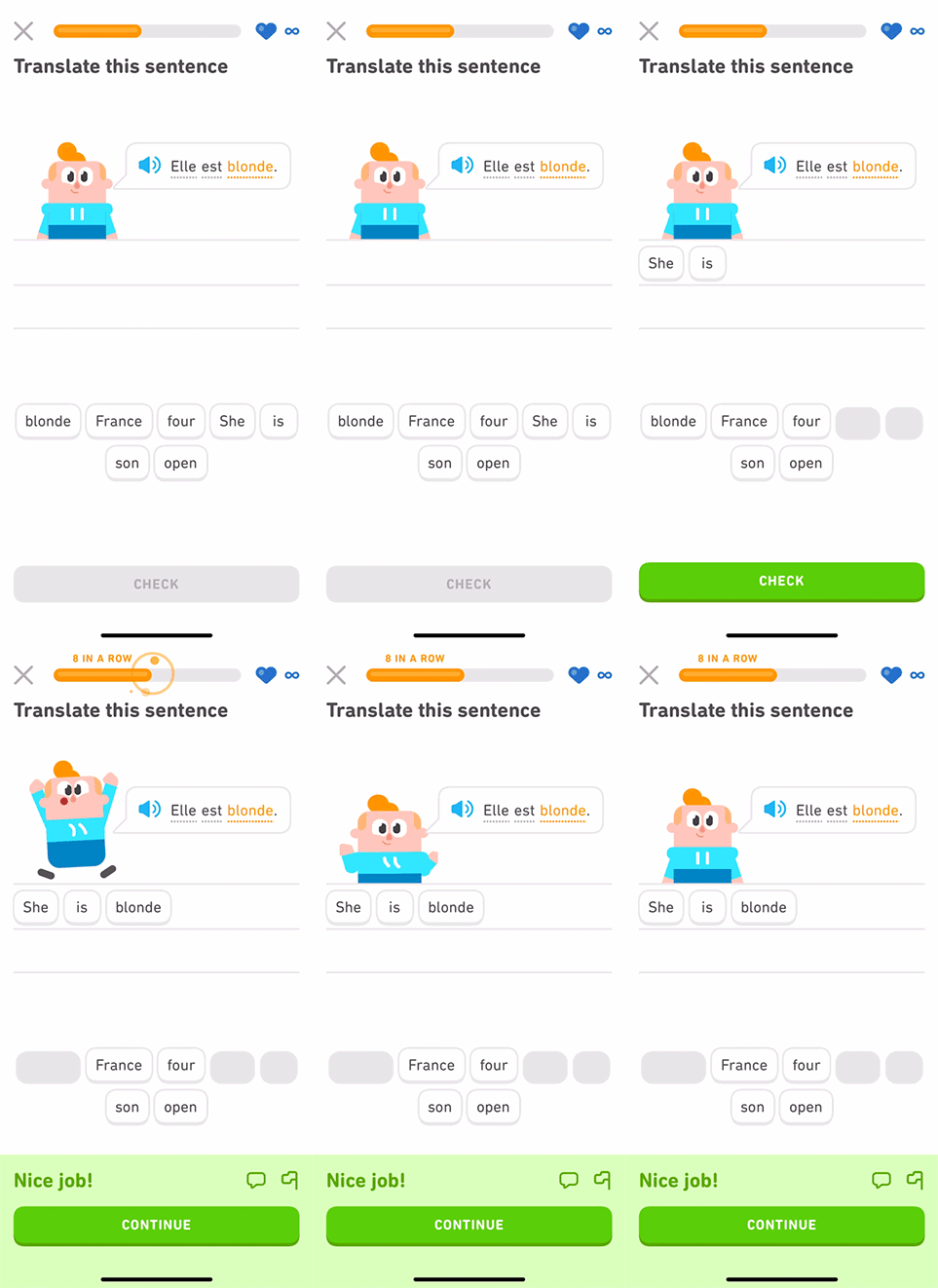
Correct answers can trigger a character reaction, sound, motion, and a visible transition toward the next exercise. Duolingo’s character-design post describes unique animations for correct answers and mid-lesson animations that reward several correct answers in a row.
Why it matters
The reaction is attached to a state change. It is not floating decoration; it tells the learner that the system recognized the result and that the session is moving forward.
What you can steal
For success, failure, loading, and waiting states, answer three questions quickly: What happened? Does it matter? What can I do next?
Add delight after those answers are clear. Keep a static, silent, reduced-motion, and non-character path for people who need or prefer one.
9. Treat the mascot as a product character
What Duolingo did
Duo is not used only on the launch page. Duolingo describes characters appearing inside exercises, speaking example sentences, reacting to correct answers, and participating in milestone moments. Its animation team built reusable states—idle behavior, speech, mouth shapes, and response states—rather than drawing an unrelated one-off reaction for every screen.
Why it matters
The product character becomes a consistent layer across the experience. Users can recognize the same world in a lesson, a celebration, a reminder, and a recovery moment.
The strongest technical lesson is the system behind the personality. Duolingo’s animation article explains how state machines and reusable mouth shapes made character motion scalable across languages, platforms, and many possible sentences.
What you can steal
Create a small state library before creating dozens of illustrations:
welcome → waiting → success → error → recovery → celebration
Use the same character logic across states, but let the message and action remain primary.
A small-team implementation example
MascoFast can be used to create a consistent mascot and transparent feedback animation for moments such as onboarding completion, a waiting state, an error, or a successful export. The point is continuity across product states—not a claim that mascots improve retention or conversion.
10. Make rewards explain progress
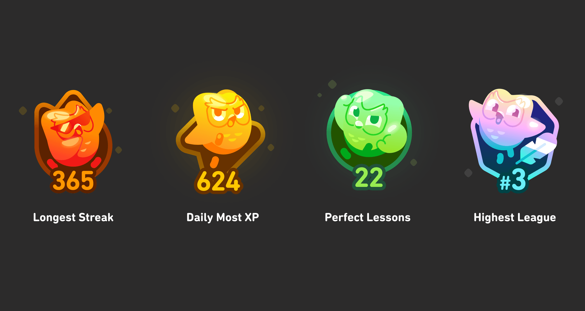
What Duolingo did
Duolingo’s achievements work gives users named milestones and a way to see personal records. The reward is not only a number; it is a label for what the learner did.
Why it matters
Named rewards help users remember the behavior behind the reward. “Personal best” carries a different meaning from an anonymous points total.
What you can steal
Reward a meaningful unit and name it in the user’s language. “Three drafts reviewed” or “first project shipped” gives a points system a reason to exist.
Do not reward repeated opens when the product’s value comes from completing a substantive task. Otherwise users can optimize the score while the real work stays unfinished.
11. Use social mechanics as cooperation before competition
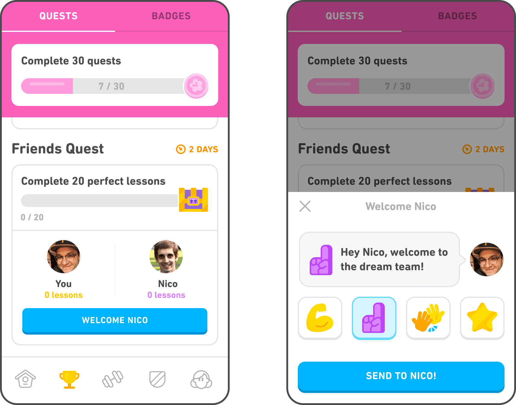
What Duolingo did
The Friends Quest screen combines a shared target, visible progress, two people, a deadline, nudges, and a reward. Duolingo’s product page says Friends Quests pair friends for a five-day challenge and allow lightweight messages or gifts.
Why it matters
The mechanic gives social context to an otherwise private activity. It also creates a cooperative alternative to “beat everyone else.”
What you can steal
Start with a private or cooperative path. Add comparison only when it supports the user’s actual job.
For a team product, a shared milestone may be better than a public ranking. For a creative tool, a co-review goal may be more useful than points for the number of files opened.
12. Make reminders continue the product, not interrupt it
What Duolingo does
Duolingo’s product system connects streaks, daily goals, quests, friends, and notifications. The mechanism is a reminder with context: there is a visible commitment, a next action, and a reason the action matters now.
Why it matters
A notification is only the first half of a return loop. The destination has to restore context and make the intended action easy to complete. Otherwise the notification creates a click without a useful session.
What you can steal
Design the whole sequence:
user intent → permission at the right moment → relevant reminder → useful destination → meaningful completion
Measure the completion event, not only the notification open. Add quiet periods, category controls, frequency limits, and a way to continue without shame or unnecessary competition.
Current screenshot needed
The local visuals in this draft document Duolingo’s published product examples, but they do not prove the exact current notification copy or permission flow for every account. Capture one current notification-to-destination flow manually and record device, OS, app version, region, account state, and date before publication.
HUMAN_ASSET_REQUIRED: Current Duolingo notification permission → reminder → destination flow on one documented iOS or Android account; obtain it from the live Duolingo app and record device, OS, app version, region, account state, and capture date.
The teardown takeaway
The parts worth stealing are not “streak,” “XP,” or “mascot” in isolation. They are the product decisions underneath:
- ask for the user’s goal, then use it;
- let the first action demonstrate the product;
- make the next step obvious;
- turn real sequences into visible paths;
- separate continuity from the full goal;
- design recovery before failure happens;
- attach motion and character to a meaningful state;
- name rewards after the behavior they represent;
- prefer cooperation when competition is not the point;
- measure meaningful completion, not just return activity.
Before adding a mechanic, write down the behavior it should change, the real outcome it should support, the smallest meaningful unit, and the safety check that would tell you to remove it.
That is the part of Duolingo’s app experience that travels well.
Keep exploring
Turn the idea into a usable mascot system, then check the exported animation before it reaches your product.