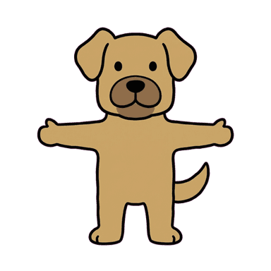
SaaS Mascot Generator
A growing number of SaaS products lean on a character instead of (or alongside) a pure logomark — Intercom's use of illustrated characters, Notion's varied cast, and Bear's hand-drawn polar bear are all the same underlying move: a mascot signals a human, approachable team behind the product, which matters more the more "faceless" and utilitarian the software category already feels. It shows up in empty states, onboarding flows, 404 pages, and marketing pages — small, recurring moments that add up to a brand feeling built by people, not a template.
Create Your MascotWhy a mascot works here
B2B software is often visually interchangeable — similar dashboards, similar blue-and-white color schemes, similar stock illustration styles. A character is one of the few brand elements a competitor genuinely can't copy, because it's tied to your specific product's personality rather than a generic design trend. It also gives empty states and onboarding moments — usually the least designed parts of a product — somewhere to put real personality instead of a blank placeholder.
Best for
- SaaS products wanting a friendly, human alternative to a purely corporate visual identity
- Onboarding flows, empty states, and error pages that need personality instead of a blank placeholder
- Startups positioning against larger, more corporate-feeling competitors
- Marketing pages and changelogs wanting a consistent character to narrate updates or announcements
Recommended styles
FAQ
Doodle-style hand-drawn characters are the most common choice for SaaS specifically — Intercom, Notion, and Bear all use doodle-adjacent illustration for exactly this reason — but a cleaner 3D Render or Plushie mascot also works well for products wanting a more polished, less hand-crafted feel.