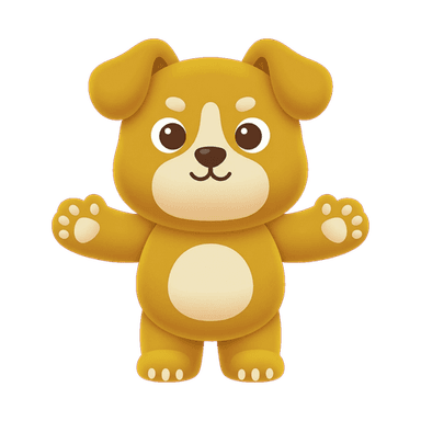
App Icon Mascot Generator
An app icon has one job: get tapped instead of the forty other icons around it, at a size where fine detail simply disappears. A character-based icon has a real structural advantage over an abstract logomark here — a face and a silhouette are two of the fastest things a human eye parses, even shrunk down to a thumbnail. A mascot built specifically for icon duty needs bold shapes, high contrast, and a design that doesn't fall apart at small sizes — which is a different brief than a full illustration meant to be viewed large.
Create Your MascotWhy a mascot works here
Icon design research and app-store best practice both converge on the same idea: simplicity and instant recognizability beat detail at icon scale. A generic gradient-and-glyph icon blends into a grid of near-identical competitors; a character with a clear silhouette and a couple of high-contrast color blocks reads instantly and gets remembered after a single glance, which is what actually drives a return visit or a recommendation ("the app with the little [character]").
Best for
- Any app that wants to stand out on a home screen full of similar-looking utility icons
- Brands building a consistent character across icon, splash screen, and marketing assets
- Apps planning eventual merch or brand extensions where the icon character needs to hold up at larger sizes too
- Teams replacing a generic logomark icon with something more memorable and ownable
Recommended styles
FAQ
Bold, simplified shapes, strong silhouette, and a small number of high-contrast colors — detail that reads fine at full size often turns to visual noise once shrunk to icon scale, so icon-ready designs deliberately simplify for that constraint.