 mascofast
How to Make a Vibe-Coded App Look Professional (Not AI-Generated)
Your app works.
The buttons respond. The data loads. The core flow is wired up.
Then you put it on your phone and notice it looks like every other AI-built app: a purple gradient, a stack of rounded cards, a safe sans-serif font, generic icons, and a button that says “Get started” even though the user is already halfway through the product.
You ask your coding agent to make it look professional. It changes the colors, adds another shadow, and somehow makes the problem louder.
The issue is usually not that the agent cannot write CSS. It is that you asked it to make dozens of visual decisions without giving it a system for making them.
This guide shows an order that works across Cursor, Claude Code, Lovable, Bolt, v0, and similar tools:
Foundation → Flow → States → Personality → QA
The order matters. A mascot, animation, or new color cannot rescue a screen whose primary action is unclear. Once the foundations are coherent, personality becomes an amplifier instead of decoration.
The fastest way to spot a vibe-coded app
“AI-generated” is not a visual style. It is a pattern of decisions that were made independently instead of as one product system.
Look for these signals:
- Every section is wrapped in its own rounded card.
- A gradient is doing the work of a brand identity.
- Several colors compete for attention without having defined roles.
- Headings, body copy, labels, and buttons do not have a repeatable type scale.
- Icons come from different visual families or are used only to fill empty space.
- Placeholder copy is still shaping the layout.
- The screen has a happy path but no useful empty, loading, error, or completion state.
- The most important action is not the easiest action to find or reach.
None of these is automatically wrong. A card can be useful. A gradient can communicate a state. A colorful interface can be exactly right for the product.
The problem is unassigned meaning. If every element is loud, users cannot tell what matters.
The case study: one sleep app, two design systems
The most useful way to review a vibe-coded app is to compare two screens that do the same job. That controls for functionality and makes the design decisions visible.
For this case study, the product is a sleep app. The “Before” screen is a plausible first pass from a coding agent. The “After” screen is a more deliberate sleep experience with a defined visual language.
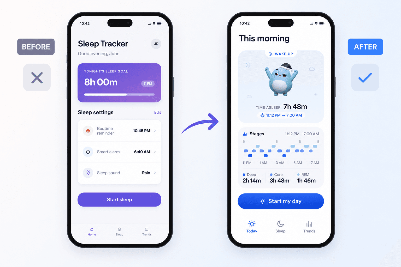
The Before screen is not broken. It has a title, a sleep goal, settings, a primary button, and navigation. It is simply interchangeable. The gradient hero, repeated cards, mixed icon shapes, and generic labels could belong to almost any health or productivity app.
The After screen makes fewer decisions, but makes them consistently. Blue has a job. The icon family matches. The hero communicates one sleep moment. Supporting details are quieter. The mascot is part of the product’s visual language rather than a random image dropped into a card.
That is the difference between a functional prototype and a product with a point of view.
Foundation: create the visual brief before prompting again
Do not begin by asking the agent to redesign every screen. First write the constraints it should apply repeatedly.
Keep the brief short enough to read before every UI task:
# Product visual brief

## Product
A calm sleep app that helps people prepare for sleep and understand the night.

## Desired feeling
Calm, clear, quietly encouraging.

## Avoid
Purple gradients as identity, nested cards, unrelated icon styles,
decorative badges, vague labels, and motion that delays an action.

## Type
One display/heading style and one body style.
Use a clear screen title, section title, body, caption, and button scale.

## Color roles
Background: white or near-white
Surface: cool, low-contrast neutral
Text: deep navy or charcoal
Primary action: one blue
Semantic colors: separate success, warning, and error roles

## Layout
Use a 4/8/12/16/24/32 spacing scale.
Use one card radius and one button radius.
Keep primary actions within comfortable thumb reach.

## Motion and imagery
Use one consistent line-icon family.
Motion should explain a sleep moment or provide feedback.
Respect reduced-motion preferences.
This is more useful than “make it modern” because it gives the agent decisions it can reuse. Lovable’s design guidance makes the same general recommendation: provide visual direction and references early instead of hoping a vague style request will produce a coherent result. Lovable’s prompting guidance is also useful when turning a product idea into smaller, testable requests.
Audit before you edit
Ask the agent to inspect the app first. A good audit tells you whether the problem lives in the tokens, the components, the content, or the flow.
Audit this app for patterns that make it feel like generic AI-generated UI.
Review the main mobile screens and identify evidence for:

- visual hierarchy and competing primary actions
- typography and inconsistent type roles
- color roles and decorative gradients
- repeated cards, spacing, radii, and shadows
- icon consistency and unnecessary decoration
- copy that sounds like a placeholder
- missing empty, loading, error, success, and returning-user states
- mobile touch reach, safe areas, and keyboard behavior

Return a table with: screen, evidence, user impact, severity, and recommended fix.
Rank only the three highest-impact fixes. Do not edit code yet.
Flow: fix hierarchy before styling
Before you choose a font or color, identify what the user came to do.
On the Before sleep screen, the sleep goal, settings, reminders, sound, and “Start sleep” button all compete for space. The user can probably understand it, but the screen does not guide attention strongly.
On the After screen, the current sleep moment is the lead. The supporting rows explain the schedule. The primary button is visually obvious and close to the bottom of the useful content. Navigation remains available without competing with the action.
Flow audit
Sleep goal, settings, reminders, and the start button compete as equal-weight blocks.
The current sleep moment leads; supporting details sit underneath one obvious action.
Use this test on every important screen:
- What is the user trying to do here?
- What should they notice first?
- What information do they need before acting?
- What can be moved, shortened, or removed?
- Can the primary action be reached without stretching or hunting?
If you cannot answer the first two questions in a few seconds, a new visual style will not solve the screen.
Refactor only the visual hierarchy of [screen/component].

Keep the existing data flow, navigation, copy meaning, and functionality.
Make one primary action obvious, reduce competing containers, group related
information, and keep important controls within comfortable mobile reach.

Before editing, return:
1. the current hierarchy
2. the proposed hierarchy
3. each structural change and why it helps
4. any behavior change that would be required

Do not add gradients, new features, or decorative animation.
Type: give the app a repeatable voice
You do not need an unusual font to make an app feel designed. You need a small type system that does not change its mind from screen to screen.
Define five roles:
- Screen title: the page’s main context.
- Section title: a group within the page.
- Body: the explanation or task content.
- Caption: supporting metadata, timestamps, and hints.
- Button: the action label, with enough weight to be read quickly.
The Before screen uses the familiar visual recipe of a bold title, all-caps card label, large number, and several small labels. The After screen uses utility labels more sparingly and lets the main heading and sleep summary do the work.
Use real copy while designing. “Sleep settings” and “Start sleep” tell the user more than “Your experience” and “Get started.” Real words reveal whether a row wraps, whether a button is too wide, and whether the hierarchy survives translation or larger text settings.
Inspect the current app and propose a compact type system for mobile.
Define screen title, section title, body, supporting text, caption, and button
roles with font family, size, weight, line height, and letter spacing.

Use real product copy from the existing screens. Find duplicate or conflicting
styles and recommend one replacement token for each. Preserve accessibility
and readable contrast. Return the proposal before changing code.
Color: make every color earn its place
Color should explain the interface.
In the Before screen, purple and violet are doing too many jobs: they create the hero, imply progress, and attract attention. The result looks familiar because the same treatment appears across AI-generated dashboards, landing pages, and app mockups.
The After screen uses a restrained blue ramp. Strong blue can mark the active tab, sleep data, and the primary action. Pale blue can create a quiet informational surface. Neutral backgrounds keep the screen readable.
Color audit
Purple gradient is asked to be the brand, the progress signal, and the main visual attraction.
Blue has defined jobs: action, active navigation, and sleep data; surfaces stay quiet.
Create roles, not a collection of attractive hex values:
| Role | Job |
|---|---|
| Background | Give content room to breathe |
| Surface | Group related information without shouting |
| Text | Make the main content readable |
| Muted text | Support the main content without disappearing |
| Primary action | Identify the next useful action |
| Success / warning / error | Communicate system meaning |
Do not use the success color for decoration, or the error color as a brand accent. Do not rely on color alone to communicate status.
Map every color currently used in this app to a semantic role.
Return: current value, proposed token, intended meaning, contrast concern,
and affected components.

Reduce decorative colors. Keep one primary action color, quiet surfaces,
readable text, and separate semantic colors for success, warning, and error.
Do not change the product’s behavior or invent a new brand direction.
Components: remove design drift
Once the hierarchy, type, and color roles are clear, standardize the pieces that repeat.
Start with the smallest useful inventory:
- button: primary, secondary, disabled, pressed
- surface: grouped information, not a wrapper for every element
- list row: icon, label, supporting value, optional action
- status label: one treatment for utility metadata
- tab bar: active, inactive, and touch target rules
- system message: empty, loading, error, and success variants
The goal is not to make every element identical. It is to make each variation intentional. A primary button can be solid and prominent. A navigation item can be quiet. A row can be separated by a hairline instead of a full card.
Use a spacing scale such as 4, 8, 12, 16, 24, and 32. The exact numbers are less important than avoiding one-off values that accumulate into drift.
Compare the main mobile screens against the approved visual brief.
Find inconsistent spacing, radii, colors, typography, icon sizes, button
variants, list rows, tabs, and shadows.

Return a table with: file/component, current value, target token, and risk.
Separate safe visual refactors from changes that could affect behavior.
Do not redesign the product or introduce new component variants without a reason.
States: design what the agent usually skips
A polished screenshot is not enough if the real flow collapses when something changes.
Design the states alongside the component that owns them:
| State | Weak version | Better direction |
|---|---|---|
| Bedtime | A generic goal card | Show the sleep window and one clear start action |
| Loading | A blank spinner | Explain what is being measured or prepared |
| Error | “Something went wrong” | Say what failed and whether retrying or continuing is possible |
| Success | The screen silently changes | Confirm what happened and offer the next useful action |
| Returning user | The same setup every time | Open on the relevant tonight or morning context |
The copy is part of the design. “Rain” is more useful than “Sound selected.” “Start sleep” is more direct than “Continue.” A useful error message gives the user a recovery path instead of asking them to interpret a failure.
When the operation takes time, preserve the user’s place. When input can be recovered, preserve it. When the user can leave and return, explain that. These details make the app feel reliable even before you add personality.
For [core flow], design the empty, loading, error, success, disabled, and
returning-user states.

For each state specify:
- exact user-facing copy
- primary action and recovery action
- what data is preserved
- visual feedback
- accessibility announcement or focus behavior
- what happens if the user leaves the screen

Keep the same component and visual tokens across states. Return the matrix
before implementing it.
Personality: add it after the foundation
Personality is not a pile of stickers, a mascot in every corner, or an animation on every button.
Give it a user-facing job:
- orientation: help the user understand where they are
- reassurance: make waiting or recovery feel less sterile
- feedback: acknowledge a completed action
- recognition: make the product easier to remember
The polished sleep screen uses a consistent mascot and motion language to make a sleep moment feel more ownable. That asset works because the screen already has clear hierarchy, useful copy, quiet surfaces, and a single visual system.
For this kind of character asset, MascoFast can generate the mascot and transparent looping animation, so the same character can be reused in a sleep or wake-up state instead of generating a different illustration for every screen. That is an implementation choice, not a retention claim. The character does not make a confusing flow clear by itself.
Personality audit
A decorative illustration is added to make the screen feel less empty, without a clear product role.
One recurring character supports the sleep or wake-up moment after the usability and visual system are already clear.
Use the following order when adding a visual character:
- Functional: plain copy and one clear action.
- Designed: stronger hierarchy, spacing, and a useful illustration.
- Branded: the same character or motion asset, with the copy and CTA unchanged.
Suggest no more than three product-specific personality opportunities in this
flow. Each must have a job: orientation, reassurance, feedback, or recognition.

For each opportunity, specify the exact screen/state, copy, asset behavior,
fallback when motion is reduced, and why it helps the user. Reject ideas that
only add decoration. Preserve hierarchy, accessibility, and action speed.
QA: make the polish survive real devices
The final pass is not another color pass. It is a check that the system survives real content and real conditions.
Review the app at 320, 375, 390, and 430 pixels wide. Test long labels, large text, empty data, slow data, failed data, and the keyboard open.
Check:
- Is the primary action still visible and reachable?
- Does the bottom navigation respect the safe area?
- Can a user tap controls comfortably without precision?
- Does focus remain visible for keyboard and assistive-technology users?
- Are status messages understandable without color?
- Does motion stop or simplify when reduced motion is enabled?
- Do loading and error states preserve the user’s work?
- Does the layout still look intentional when copy wraps?
Run final design QA against the visual brief at 320px, 375px, 390px, and
430px wide.

Check hierarchy, tokens, component consistency, safe areas, touch targets,
keyboard overlap, long text, focus states, contrast, loading/error recovery,
orientation assumptions, and reduced motion.

Return pass/fail evidence for every check with the exact screen and component.
Return the smallest remaining fix list. Do not invent a new visual direction.
The copy-paste workflow
Do not paste eight prompts into your agent at once. Use them as a sequence with a checkpoint after each stage:
- Ask for an audit. Save the output.
- Approve the visual brief and token proposal.
- Fix hierarchy on the core flow.
- Apply type and color roles.
- Standardize shared components.
- Add the real states.
- Add one or two personality details with a clear job.
- Run mobile QA and fix only the remaining issues.
The agent is good at implementing a direction. It is less reliable at inventing a coherent direction while also building the feature. Small, staged prompts give you a way to inspect the direction before the next change compounds it.
15-point vibe-coded app polish checklist
- The app has a short visual brief with explicit avoid rules.
- Every important screen has one obvious primary action.
- Screen titles, section titles, body text, captions, and buttons use repeatable roles.
- Color is organized by semantic role instead of decoration.
- Spacing follows a small repeatable scale.
- Cards group related information instead of wrapping every element.
- Buttons, inputs, rows, and tabs use intentional shared variants.
- Real product copy replaces placeholder labels and fake numbers.
- Empty states explain what is missing and what to do next.
- Loading states explain what is happening and preserve the user’s place.
- Error states explain recovery and preserve recoverable input.
- Success states confirm the result and offer a useful next action.
- Touch reach, safe areas, keyboard behavior, and narrow widths have been tested.
- Focus, contrast, disabled, and reduced-motion states are visible and usable.
- At least one detail makes the app recognizably yours without adding noise.
Final thought
Making a vibe-coded app look professional is not about hiding that AI helped build it.
It is about replacing default decisions with connected decisions.
Start with the foundation. Make the flow obvious. Design the states. Add personality where it helps. Then test the result on the devices and conditions your users actually have.
The sleep-app comparison makes the difference visible: both screens can be functional, but only one has a clear point of view. That point of view is not a gradient or a mascot. It is the system underneath them.
Give your coding agent that system, and it can help you build an app that looks made rather than merely generated.
Further reading
- Apple: Add personality to your app through UX writing
- Lovable: Design guidance
- Expo: How to apply professional design principles in AI app development
- The Crit: Why your vibe-coded app looks like every other AI app
- BUILD: Design tips to make your vibe-coded app look professional
Keep exploring
Turn the idea into a usable mascot system, then check the exported animation before it reaches your product.