 mascofast
How to Make Your App More Engaging: A Symptom-to-Intervention Framework
If your app gets installs or initial opens but users do not reach value, return, or adopt important features, adding more engagement tactics may not solve the problem.
You may be measuring the wrong behavior or addressing the wrong failure point. If the underlying issue is that the product feels inconsistent or generic, first review the practical app-branding workflow before adding engagement mechanics.
A productivity app can have long sessions because its workflow is confusing. A reminder app can have many notification clicks but few completed actions. A learning app can have short sessions because users complete lessons efficiently. These are illustrative examples, not measured customer results.
A more useful question is:
Where do users stop progressing, and what change could help them complete a meaningful task?
Use this practical sequence:
Diagnose → Define value → Instrument → Prioritize → Intervene → Evaluate
The goal is not to maximize opens, notification clicks, or time spent. It is to help users complete the task your app exists to support, return when they have a legitimate reason, and remain in control of the experience.
If you only do three things
- Define one meaningful outcome for your app.
- Locate the largest consequential drop in the user journey.
- Test one proportionate intervention with a primary metric and guardrails.
A guardrail is a measure that helps you detect unwanted side effects. For example, activation may improve while errors, opt-outs, or incomplete follow-up tasks also increase.
1. Define meaningful engagement for your app
“Engagement” is too broad to guide a product decision by itself. Define the behavior that represents value for your specific app.
| Dimension | Working definition | Example question |
|---|---|---|
| Activation | The first useful outcome a user reaches | Did a new user complete their first project? |
| Feature adoption | Use of a capability that supports the core value | Did a team invite a collaborator? |
| Repeat usage | Returning for a legitimate recurring reason | Did a learner complete another lesson? |
| Retention | Returning after a defined interval | Did the installation cohort return in week two? |
| Session quality | Completing the intended task clearly and effectively | Did the user finish without errors or confusion? |
Retention is one part of engagement. Apple App Store Connect describes retention through cohort-based return behavior after installation, with views that can help compare releases, onboarding changes, campaigns, regions, and app versions. It does not define every form of engagement for every product. (Apple App Store Connect: App retention)
For your app, write down:
- The primary value event: the action that shows the user received meaningful value.
- The expected return interval: when a user would reasonably come back.
- The quality guardrail: what must not worsen while the primary metric improves.
Examples of app-specific value events include:
- Education: completing a lesson or assessment.
- Productivity: creating or completing a task.
- Commerce: completing a relevant purchase journey.
- SaaS: completing a core workflow.
- Health: recording or reviewing a meaningful activity.
These are categories of examples, not universal event definitions.
A measurement principle for your team might be:
Treat opens, clicks, and session length as supporting signals unless they connect to a meaningful outcome.
A shorter session may be a positive usability signal if the user completes the intended task efficiently. A longer session may warrant investigation if the user is stuck, searching, or recovering from errors. These are interpretations to test against your own product data, not universal rules.
Your value definition
Primary value event:
Expected return interval:
Quality guardrail:
For example:
Primary value event: lesson_completed
Expected return interval: another lesson during the learner’s normal study cycle
Quality guardrail: completion without repeated errors or abandoned attempts
2. Diagnose the failure point in the user journey
Map the path from opening the app to completing a meaningful task:
App open
   ↓
First useful outcome
   ↓
Key-feature use
   ↓
Return for a legitimate reason
   ↓
Meaningful task completion
This diagram represents five stages. In prose: first determine whether users open the app, reach first value, use an important feature, return for a reason connected to the product, and complete a meaningful task.
For each stage, ask:
- How many users progress?
- Where is the first significant drop?
- Is the drop consequential to the user’s goal?
- What do errors, support requests, usability observations, and performance data suggest?
- Could the observed behavior be appropriate for the product rather than a problem?
Do not treat one metric as proof of a diagnosis. A low return rate, for example, could mean that users completed the only task they needed, that progress was not saved, that the next action was unclear, or that the product does not yet offer recurring value.
Symptom-to-intervention decision table
The likely causes below are hypotheses to investigate. The first intervention is a starting point, not a universal fix.
| Symptom | Diagnostic question | Likely causes to investigate | First intervention | Primary metric | Guardrail |
|---|---|---|---|---|---|
| Users abandon before first success | Do users understand the next action, and where do they stop? | Unclear value, excessive setup, premature permissions, or onboarding friction | Shorten onboarding or add contextual guidance | Activation rate | Error rate and setup completion |
| Users complete one task but rarely return | Is there a legitimate next reason to return? | Weak recurring value, unsaved progress, or poor workflow continuity | Improve saved state, unfinished-work recovery, or a relevant reminder | Meaningful repeat usage | Opt-outs, deletions, or support complaints |
| Users return but miss a key feature | Do users see the feature but fail to start or complete it? | Poor discoverability, unclear labels, or overloaded navigation | Improve hierarchy, empty states, labels, or progressive disclosure | Feature adoption | Task completion time |
| Notifications are ignored or disabled | Are messages relevant, timely, distinct, and controllable? | Irrelevance, repetition, poor timing, or excessive frequency | Reduce frequency and improve relevance, controls, and deep links | Downstream meaningful action | Disablement and opt-out rate |
| Sessions are long but task completion is low | Do users encounter friction, errors, or confusing recovery paths? | Unclear flow, slow performance, inaccessible controls, or weak feedback | Fix the highest-friction step and improve loading, success, and error states | Task completion rate | Error rate, crash rate, or session duration |
| Failures cluster on poor networks | Do errors or abandoned attempts increase under weak connectivity? | Unreliable loading, missing retry paths, or weak offline behavior | Improve loading, retry, recovery, and offline states | Successful task completion | Data loss and support complaints |
| Users cannot complete a flow with assistive technology | Do labels, focus order, contrast, and touch targets support the flow? | Accessibility defects | Fix the affected interaction and test it with relevant assistive technology | Completion rate for the affected flow | Accessibility regressions |
Keep this table as the decision layer. The implementation guidance that follows explains how to investigate and address the categories; it is not a second list of independent engagement tactics.
3. Improve activation and the path to first value
Activation means reaching the first useful outcome. Onboarding should help users begin the core task rather than require them to understand the entire product first.
Nielsen Norman Group recommends brief, optional onboarding focused on what users need, with contextual tips introduced when they become relevant. It also recommends postponing unnecessary data collection and using progressive disclosure to defer secondary complexity. These are UX recommendations, not causal retention evidence. (Nielsen Norman Group: Mobile-App Onboarding, Nielsen Norman Group: Progressive Disclosure)
Illustrative onboarding comparison
A long first-run flow might look like this:
Create account
   ↓
Grant permissions
   ↓
Choose preferences
   ↓
Watch product tour
   ↓
Configure workspace
   ↓
See empty dashboard
An alternative to investigate could be:
Choose what you want to accomplish
   ↓
Start one core action
   ↓
Reach the first useful outcome
   ↓
Receive one contextual explanation
   ↓
Configure optional features later
This is an illustrative flow, not a guaranteed conversion pattern. Measure whether more users reach the defined activation event, while checking errors, support requests, completion quality, and early return behavior.
A quick activation audit:
- Can a new user start the core action immediately?
- Is the next action clear?
- Are permissions requested only when their benefit is understandable?
- Is optional setup visibly optional?
- Are secondary features deferred until they become relevant?
- Does the first action produce a meaningful result?
Implementation effort may vary:
- Quick audit: inspect the first screen and record where a new user hesitates.
- Small UX change: clarify the primary action or defer optional setup.
- Engineering fix: remove a technical blocker in account creation or first-run loading.
- Research step: observe several first-time users completing the flow.
Implementation note: a small team could use one consistent MascoFast mascot animation in a success state, empty state, or onboarding moment if it clarifies the state and fits the product’s tone. This is an implementation option and design hypothesis, not evidence that mascots improve engagement.
4. Improve feature discovery and task completion
Users need to find, understand, and successfully complete an important feature. Treat the following as an editorial audit checklist and investigate the items most relevant to the diagnosed failure:
- clear visual and information hierarchy;
- meaningful empty states;
- obvious next actions;
- understandable labels;
- feedback after saves, uploads, and submissions;
- clear loading, success, and failure states;
- retry and recovery paths;
- readable text and sufficient contrast;
- labels that assistive technologies can interpret;
- logical focus order;
- sufficiently large touch targets;
- responsive performance;
- graceful behavior on poor networks or offline;
- localized text that does not break layouts;
- limited or optional motion.
Nielsen Norman Group’s progressive-disclosure guidance supports presenting primary options first and deferring secondary complexity. Android’s user-experience guidance describes hierarchy, imagery, animation, and narrative as useful when they communicate meaningfully and do not distract from use. These sources provide design guidance, not quantified engagement effects. (Nielsen Norman Group: Progressive Disclosure, Android Developers: What a great user experience looks like)
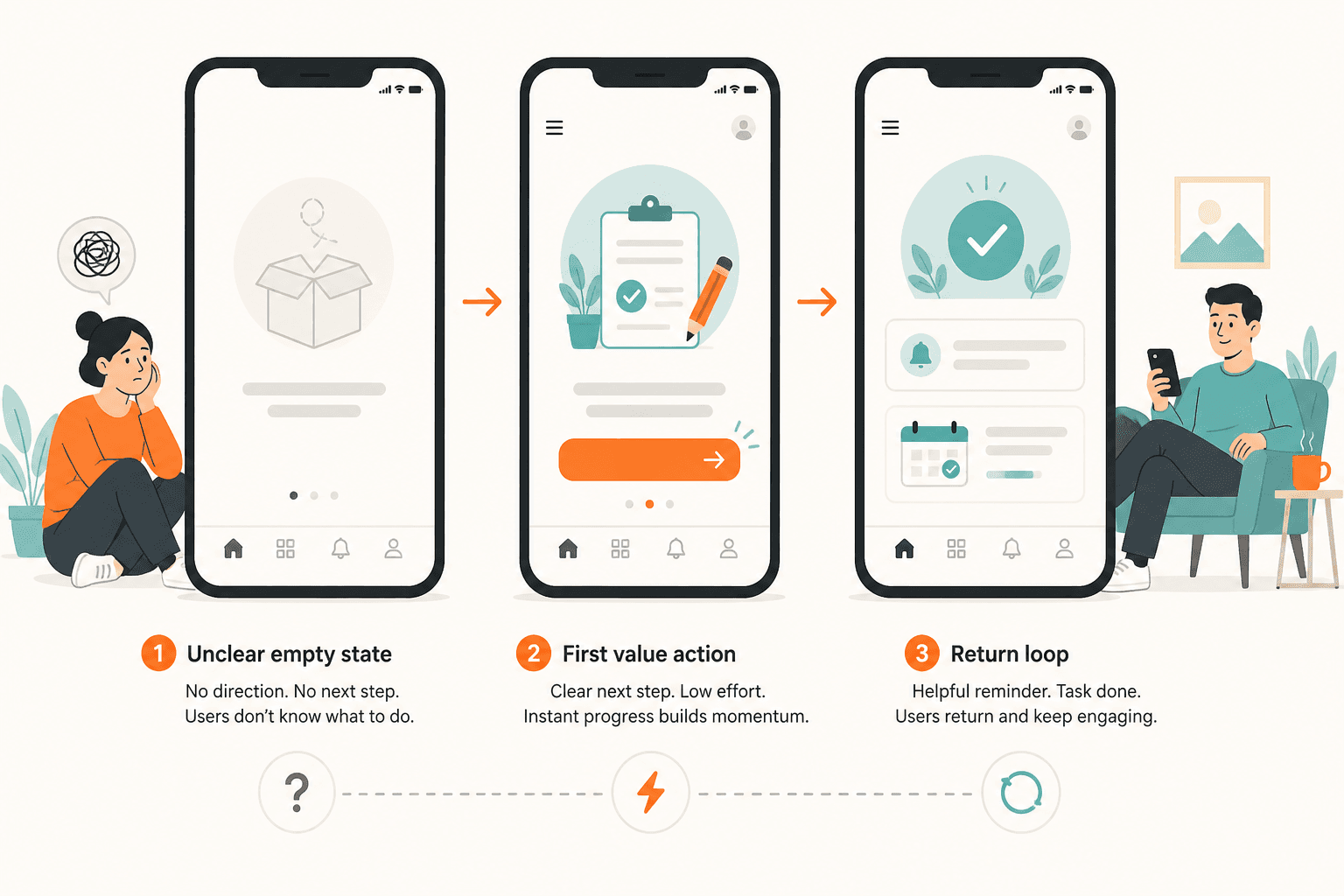
Empty-state pattern
An empty screen should answer:
What is the current status?
Why is it empty?
What should I do next?
Illustrative example:
No projects yet

Projects help you group related tasks and files.

[Create your first project]
A visual element can support comprehension, but the state and next action should remain clear without it.
Feedback-state sequence
For an important action, review the complete sequence:
Loading → Success → Next useful action
    ↓
Recoverable error → Retry or alternative path
A spinner, success message, or error state is a risk to investigate when it leaves users uncertain about what happened or what to do next. Do not assume that animation or motivational mechanics will fix a slow, inaccessible, unstable, or difficult-to-recover workflow.
5. Create a legitimate reason to return
Repeat usage should follow from recurring user value. Returning every day is not automatically better than returning when the user has a meaningful reason.
A possible recurring-value loop is:
User need → Useful outcome → Saved context or progress → Relevant reason to return
Depending on the product, recurring value might involve:
| Product type | Illustrative recurring value |
|---|---|
| Learning or creative tools | Saved progress and unfinished work |
| Content products | Fresh, relevant content |
| SaaS products | Ongoing workflows and collaboration |
| Scheduling products | Expected tasks and reminders |
| Games | New challenges or meaningful progression |
| Commerce and services | Transaction, delivery, or status changes |
If users complete one task and do not return, investigate whether the app supports a useful next step:
- saving progress automatically;
- making unfinished work easy to resume;
- surfacing the next relevant task;
- preserving context between sessions;
- providing genuinely new information;
- showing status changes the user expects;
- making collaboration or handoffs visible.
Do not add content cadence, streaks, or reminders simply because usage frequency is low. Low frequency may be appropriate for the product.
6. Use notifications conditionally
Notifications can make a valuable experience more timely. They cannot replace unclear value or poor usability.
Apple recommends timely, high-value, concise, non-repetitive notifications and contextual permission requests. Android’s guidance for Android 13 and later recommends allowing users to become familiar with the app before requesting notification permission. Verify current platform behavior before publication. (Apple Human Interface Guidelines: Notifications, Apple: Asking permission to use notifications, Android Developers: Notification runtime permission)
Notification flow
User intent
   ↓
Contextual permission request
   ↓
Relevant reminder
   ↓
Deep link to the useful destination
   ↓
Meaningful completion
In prose: first identify a relevant user need, explain the benefit of permission, send a reminder that matches the user’s context, link directly to the relevant screen, and measure whether the user completes the intended task.
Before sending a notification, ask:
- Is this information useful now?
- Is the message concise?
- Is the timing relevant?
- Could the notification be duplicated?
- Is frequency limited?
- Can users configure quiet periods or categories?
- Does it deep-link to the useful destination?
- Could sensitive information appear on a lock screen?
- Can users opt out without losing access to the core product?
- Will the team measure downstream completion rather than only the click?
Illustrative example:
User intent: The user schedules a task.
Reminder: The app sends one relevant reminder later.
Destination: The reminder opens the unfinished task.
Primary outcome: The user completes the task.
Proxy signal: The user taps the notification.
An adaptive-notification study found that delaying real notifications until a more opportune moment was associated with faster responses and higher notification engagement in its specific application, population, and scheduling system. That result does not show that notification opens equal meaningful product value or that the same scheduling method works for every app. (Real-world large-scale study on adaptive notification scheduling)
Personalization
Treat personalization as a product hypothesis. Ask:
- Do users have genuinely different needs?
- Can the experience adapt without collecting unnecessary data?
- Are users given understandable controls?
- Could the system infer sensitive information?
- Does the change improve meaningful outcomes rather than only clicks or time spent?
Privacy-by-design recommendations include data minimization, transparent controls, and avoiding sensitive inferences. Apply the requirements relevant to your product, users, and jurisdiction rather than assuming one universal rule.
7. Treat gamification as a product hypothesis
Points, badges, streaks, levels, rewards, and challenges are tools, not default engagement requirements.
The following is a product-fit heuristic to test, not an evidence-backed likelihood claim. A mechanic may fit when it helps users understand practice, progress, mastery, completion, or chosen challenge. It may be a poor fit when it pressures users into unnecessary activity, obscures the product’s purpose, or requires intrusive tracking.
Ask:
- What user goal does the mechanic support?
- What meaningful behavior should it reinforce?
- Could users optimize the mechanic instead of the product’s value?
- Could it create pressure, shame, or compulsive checking?
- What privacy data does it require?
- Can users control comparison and reminders?
- Is it accessible to users with different abilities?
- What downstream outcome will be measured?
- Can the mechanic be removed easily?
A 2017 systematic review found positive engagement effects in 12 of 15 included studies, but the evidence was concentrated in online learning and did not establish universal effects for commercial-app retention. (Does gamification increase engagement with online programs?)
A 2024 meta-analysis of 62 studies reported relationships between gamification, customer experience, engagement, word-of-mouth, and loyalty. It identified rewards, progression, and customization as moderators, while privacy concerns weakened the relationship. These findings are context-dependent aggregate relationships, not a universal implementation recipe. (How and when does gamification level up mobile app effectiveness?)
| Supportive mechanic | Shallow mechanic |
|---|---|
| Shows progress toward completing a learning plan | Awards points for repeated opens |
| Reinforces a meaningful task | Rewards activity without measuring task quality |
| Lets users control reminders or comparison | Pressures users to maintain unnecessary streaks |
Measure meaningful completion, quality, user sentiment, and trust alongside points or streaks.
8. Instrument meaningful behavior
Instrumentation means adding reliable event tracking so the team can observe important steps in a user journey.
A practical measurement loop is:
- Define the meaningful event.
- Instrument the event and relevant steps.
- Validate that events fire correctly.
- Establish a baseline.
- Select a relevant cohort.
- Change one meaningful variable.
- Measure the primary outcome and guardrails.
- Keep, revise, or roll back based on a predefined decision rule.
Firebase Analytics supports custom events and user properties. DebugView and reporting tools can help teams validate events and analyze behavior such as notification clicks, deep-link destinations, and purchases when the team defines and instruments those events. These proxies do not automatically prove meaningful product value. (Firebase Analytics)
Illustrative event names include:
onboarding_completed
first_core_action_completed
key_feature_used
meaningful_task_completed
returned_and_completed_task
These names are examples, not universal requirements.
Measurement worksheet
| Field | Reader fills in |
|---|---|
| Meaningful event | Name the event, such as project_created |
| Journey stage | State where it happens: onboarding, activation, discovery, or return |
| Event definition and firing point | Describe the exact user action and when the event fires |
| Baseline period | Record the dates and current result before the change |
| Relevant cohort | Define which users or sessions are included |
| Intervention | Describe the one product change you will test |
| Primary metric | Choose the main outcome that should improve |
| Guardrails | List what must not worsen, such as errors or opt-outs |
| Observation period | Set the time window for reviewing the result |
| Decision rule | Define when to keep, revise, or roll back the change |
Connecting an event to a decision
Illustrative workflow:
Event: project_created
Fires: once, after the project is successfully saved
Cohort: new users entering during the documented test period
Primary comparison: activation rate before and after the change
Follow-up check: meaningful task completed within the normal usage cycle
An event should fire after the meaningful state is achieved, not merely when a screen is viewed or a button is tapped. The team should document what each event means, which users are included, and which report or query answers the experiment question.
9. Prioritize one intervention
When several problems appear plausible, choose the intervention that addresses a consequential journey drop, is close to meaningful value, has a clear mechanism, is feasible, can be measured, and carries limited user or privacy risk.
Use this illustrative scoring model:
Priority score = impact × confidence × reach ÷ effort
Rate each factor from 1 to 5. These weights and scores are examples, not industry benchmarks.
| Candidate | Impact | Confidence | Reach | Effort | Priority score |
|---|---|---|---|---|---|
| Contextual prompt at first core action | 5 | 4 | 5 | 2 | 50 |
| Add a daily streak for app opens | 2 | 2 | 5 | 2 | 10 |
The first candidate scores higher in this illustrative comparison because it addresses a diagnosed activation problem and connects directly to the core action. The streak may increase opens, but its connection to meaningful value is weaker and could encourage shallow activity.
Add risk and measurement readiness before choosing:
| Criterion | Question |
|---|---|
| Diagnosed failure point | Which journey stage is failing? |
| Expected user value | How does this help users complete a meaningful task? |
| Effort | How much design and engineering work is required? |
| Evidence strength | Is this guidance, research, a first-party example, or a hypothesis? |
| Privacy risk | Does it require additional data or sensitive inference? |
| Accessibility impact | Could it exclude or burden users? |
| Reversibility | Can it be rolled back easily? |
| Measurement readiness | Can the event and guardrails be observed now? |
If measurement readiness is low, improving instrumentation may be the best first intervention.
10. Intervene and evaluate with an illustrative test
This practical operating model is suitable for a small team, but the cohort, duration, comparison, and analysis should match the app’s usage cycle and available data.
Worked example
The following numbers are fictional and intentionally illustrative. Replace them with your own data.
Observed symptom: New users abandon before creating their first project.
Hypothesis: Users do not understand the next action after entering the workspace.
Intervention: Replace a long setup sequence with contextual guidance at the first relevant screen.
Target event: project_created
Illustrative baseline: 30% of new users create a project within the defined onboarding window.
Illustrative target: Increase activation to at least 36%, a relative improvement of 20%.
Illustrative observation period: Two normal weekly usage cycles.
Illustrative guardrail thresholds:
- project-creation error rate does not increase by more than 2 percentage points;
- median time to create a project does not increase by more than 10%;
- meaningful follow-up task completion does not decline;
- permission opt-outs do not increase by more than 3 percentage points.
These thresholds are examples, not recommended benchmarks.
Illustrative decision rule: Continue the intervention if activation reaches the predefined target and guardrails remain within the stated limits. Otherwise, revise the guidance, investigate the diagnosis, or roll it back.
Do not call the intervention successful until the team reports the population, comparison, observation period, primary metric, guardrails, and uncertainty or limitations.
Possible interpretations:
| Result | Interpretation |
|---|---|
| Primary metric improves and guardrails remain healthy | Evidence supports continuing or expanding the test |
| Primary metric improves but guardrails worsen | The change may create shallow or harmful behavior |
| No clear change | The intervention may not address the diagnosis, or the data may be insufficient |
| Primary metric declines | Reconsider or roll back the intervention |
| Data is inconsistent | Fix instrumentation before interpreting the result |
11. Illustrative one-week audit plan
A possible one-week audit can produce a testable next step, but teams may need longer if instrumentation, accessibility review, or evidence is incomplete.
| Day | Activity | Output |
|---|---|---|
| 1 | Define the app’s meaningful outcome | Value event and quality guardrail |
| 2 | Map the journey | First consequential drop |
| 3 | Validate instrumentation | Reliable events and cohort definition |
| 4 | Review UX and technical barriers | Prioritized evidence and hypotheses |
| 5 | Select one intervention | Test brief and guardrails |
| 6 | Review a relevant cohort or conduct lightweight research | Diagnosis check |
| 7 | Write the decision rule and backlog | Next action and review date |
Review:
- funnel behavior;
- event reliability;
- support requests;
- crash and error logs;
- latency;
- empty states;
- accessibility barriers;
- poor-network behavior;
- qualitative feedback.
Accessibility and performance audit checklist
Use this as a practical review list:
- Loading states explain what is happening.
- Errors identify the problem and provide recovery.
- Empty states explain status and offer a next action.
- Motion is limited, optional, or nonessential.
- Text has sufficient contrast.
- Touch targets are usable.
- Labels and semantics support assistive technology.
- Focus order follows the task.
- Important actions work under slow or unreliable networks.
- Offline behavior does not silently lose user work.
- Localization does not break layouts or truncate essential actions.
Final diagnostic checklist
Before adding another engagement tactic, ask:
- Have we defined meaningful engagement for this app?
- Where exactly do users stop progressing?
- Does the proposed intervention address that diagnosed failure?
- Have we checked performance, reliability, accessibility, and error recovery?
- Is the target event explicitly defined and validated?
- Is the cohort and comparison documented?
- Is the observation period appropriate?
- Is there a primary metric and at least one guardrail?
- Are notifications relevant, limited, and controllable?
- Does personalization minimize data and preserve user control?
- Could the tactic increase shallow activity without improving meaningful outcomes?
- Can the intervention be rolled back?
Better engagement is not more activity at any cost. It is more users reaching and returning to the value your app exists to provide.
Keep exploring
Turn the idea into a usable mascot system, then check the exported animation before it reaches your product.