 mascofast
If your app looks different in the product, App Store listing, and website, this practical app branding guide gives you an order of operations for making those touchpoints coherent.
App branding is more than choosing a logo, color, or typeface. It is a system of repeated decisions intended to make the app easier to understand, recognize, and use across its product UI, store listings, website, and promotional assets.
That system includes:
- Audience, problem, and product promise
- App name and icon
- Voice, tone, typography, color, and illustration rules
- Product UI and design tokens
- Onboarding, empty states, notifications, and feedback
- App-store listings, screenshots, website, and promotional assets
- Platform, accessibility, localization, and intellectual-property checks
For a broader product-design perspective, see the guide to making a vibe-coded app look professional. This article focuses on the branding decisions that need to stay coherent from the product promise through launch.
Apple’s branding guidance discusses the relationship between an app’s icon, product experience, App Store presence, voice, and accent color. It also recommends restrained logo use and advises against launch screens used primarily for branding. Apple Branding guidance
The sequence below is an editorial recommendation:
user promise → audience and problem → personality → naming and clearance → verbal rules → visual rules → UI tokens → platform and store assets → consistency review
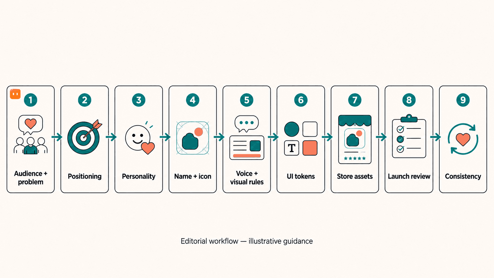
1. Define the promise before designing
Do not begin with a moodboard. Begin with the user’s problem.
Write four things:
- Who is the app for?
- What problem are they trying to solve?
- What makes your approach different?
- What should someone understand after encountering the app?
Then turn those answers into a positioning statement:
For [audience] who [problem], [app] is a [category] that [differentiator].
This sentence is not necessarily public-facing copy. It is a decision filter. If a color, icon, illustration, or feature description does not support the promise, question whether it belongs.
Illustrative example, not a measured result
Use one promise as a decision filter. For example, if the promise is “help busy freelancers see the next workable step,” each touchpoint should express that promise in its own way:
| Touchpoint | Brand decision shaped by the promise |
|---|---|
| Icon | A simple, calm silhouette that remains recognizable at small sizes |
| Onboarding | One clear first action instead of a long brand introduction |
| UI states | Direct empty-state, success, and error copy that helps the user continue |
| Store screenshots | Each frame shows a real workflow step, not a collection of disconnected features |
This is an editorial example, not a claim that the changes improve performance. It shows how one promise can guide the icon, onboarding, UI states, and store screenshots.
Positioning worksheet
| Prompt | Your answer |
|---|---|
| Primary audience | Describe the specific person or team |
| User problem | Name the job they need to complete |
| Meaningful differentiator | Explain the useful difference |
| One-sentence promise | “For [audience] who [problem], [app] is a [category] that [differentiator].” |
Ask someone unfamiliar with the app to read the statement and describe the expected product experience. If they expect a playful social app but your interface is a serious financial tool, revisit the promise before designing further.
2. Choose a usable name and icon concept
Evaluate the name in every context where users may encounter it:
- App Store and Google Play search
- Spoken conversation
- Search engines
- Target languages and markets
- Domains and social handles
- Relevant trademark databases
- Short labels, notifications, and system UI
Apple’s App Review Guidelines specify requirements for App Store metadata, including app-name limits and accurate representation of the app. The guidelines also address intellectual-property concerns. Check the relevant sections immediately before publication because requirements can change. Apple App Review Guidelines
If you need a starting point for name ideas, you can use the startup name generator or mascot name generator as brainstorming tools. Generated names still need collision, localization, and trademark checks.
The USPTO provides federal trademark-search guidance. A federal search is an early U.S.-focused check, not complete legal clearance; material naming risk may require qualified trademark counsel. USPTO Federal trademark searching
Name-clearance checklist
- Is the name distinct from competing apps in the target stores?
- Can people pronounce and spell it after hearing it once?
- Does it have an undesirable meaning in a target language?
- Is it easy to read in a notification or narrow header?
- Are relevant domains and social handles available or reasonably usable?
- Have relevant trademark databases been searched?
- Has a qualified professional reviewed material naming risk?
- Does the name still make sense if the product expands?
First clear the name; then design the icon
Naming checks can block later visual work, while icon testing is a separate design task.
For this workflow, it is useful to treat the app icon as a separate asset from the company logo. They may share ingredients, but the icon must work in a launcher, search result, store listing, settings screen, and possibly a masked or themed environment.
Apple’s icon guidance covers recognizable forms, layered icons, safe areas, appearance variants, and platform-specific specifications. Apple App Icons guidance
On Android, adaptive icons can change according to a device’s mask, launcher, visual effects, and user theming. Android documents separate foreground and background layers and a monochrome layer for themed icons. Android adaptive icons
A safe zone is the part of an icon that should remain clear because a launcher may crop or mask the artwork. A themed icon is an icon treatment that allows the launcher or user theme to apply a coordinated appearance. An adaptive icon uses platform-specific layers and masking instead of assuming one flat image will fit every launcher.
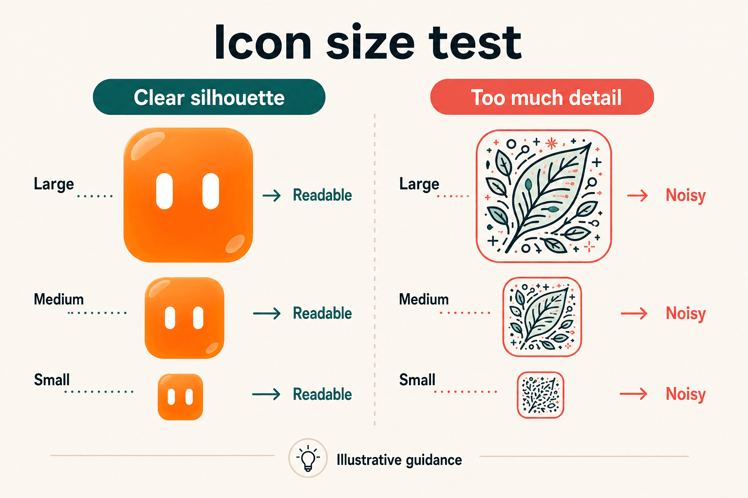
Small-size icon test
Illustrative evaluation, not a performance test:
- Export the icon at realistic launcher and store-preview sizes.
- View it on light and dark backgrounds.
- Reduce it until the main silhouette is only a few millimeters wide on screen.
- Ask:
- Is the primary shape still clear?
- Do details merge into noise?
- Does it still work without the wordmark?
- Does the concept remain recognizable after platform masking?
- Test the construction against each platform’s current safe-area and mask guidance.
3. Turn personality into verbal and visual rules
“Friendly” and “modern” are starting points, not operating instructions. Choose three to five traits and describe how each trait changes a decision.
| Trait | Sounds like | Looks like | Avoid |
|---|---|---|---|
| Calm | “Start with one thing.” | Quiet surfaces and generous spacing | Urgent gradients and constant motion |
| Direct | “Add a client deadline.” | Clear hierarchy and short labels | Vague buttons such as “Continue” everywhere |
| Encouraging | “You have a workable next step.” | Positive feedback without confetti in every state | Guilt, shame, or exaggerated praise |
| Focused | “Plan this week.” | One strong action per screen | Competing calls to action |
These are editorial recommendations, not universal rules. The right personality depends on the product and audience.
Create a compact voice guide
| Situation | Preferred | Avoid |
|---|---|---|
| Empty state | “Your week is clear. Add the first commitment.” | “Nothing here yet!!!” |
| Error | “We couldn’t save that. Try again.” | “Oops! Something went terribly wrong.” |
| Success | “Deadline added.” | “You crushed it like a productivity legend!” |
| Reminder | “Review Friday’s client work.” | “Don’t forget again.” |
Also define:
- Words you use frequently
- Words you avoid
- Sentence length
- Punctuation style
- Whether the app speaks as “we,” “you,” or neither
- How the app handles uncertainty and failure
- How copy changes during localization
If the brand needs a short public-facing phrase, use the tagline generator only for ideation, then check every suggestion against the positioning statement and the product’s actual capabilities.
Define visual rules
A lightweight visual system should specify:
- Primary and supporting colors
- Semantic status colors
- Light and dark theme behavior
- Type hierarchy
- Shape and corner-radius scale
- Spacing rhythm
- Icon style
- Photography or illustration treatment
- Motion principles
- Mascot or character rules
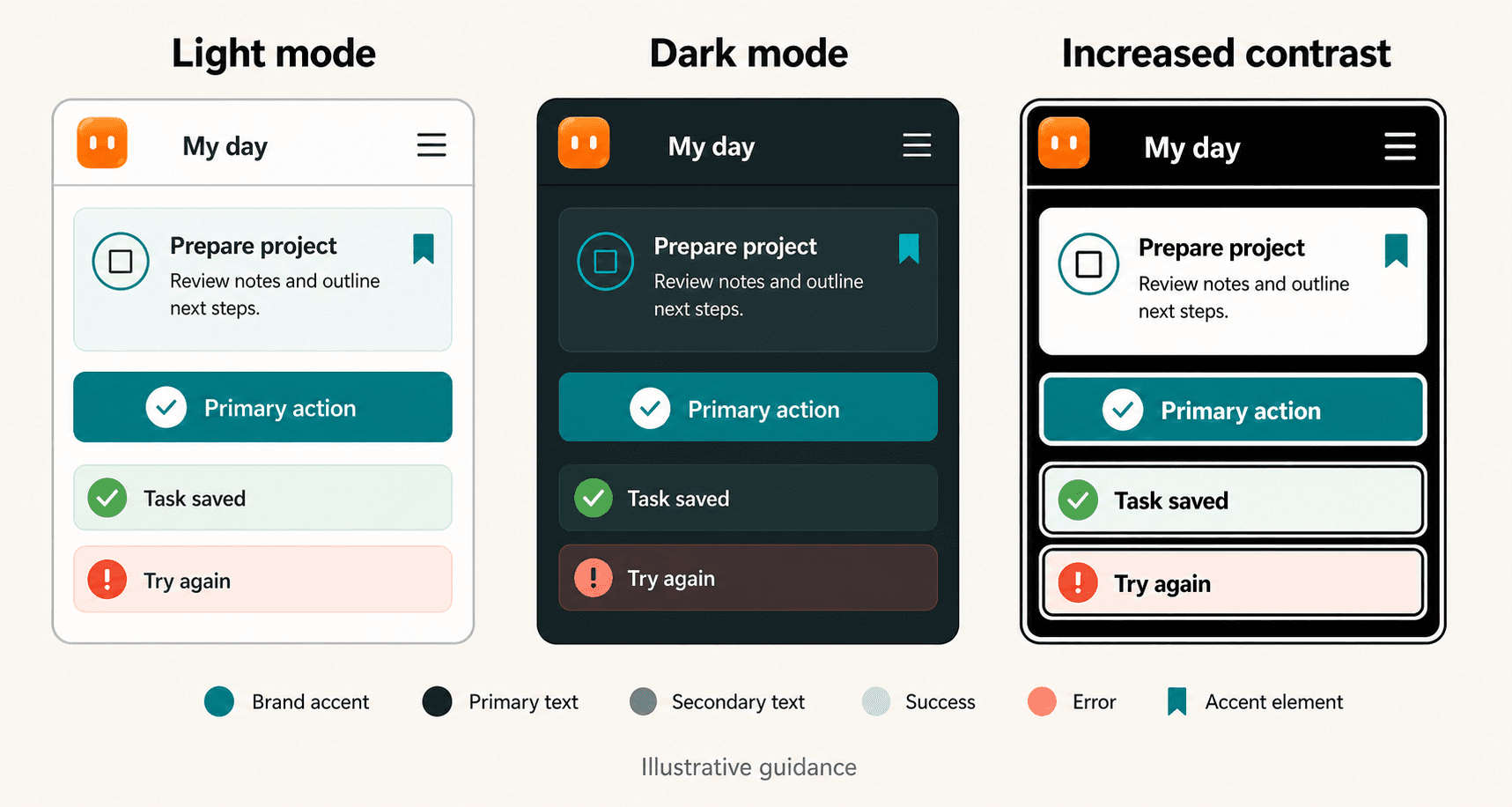
Apple’s color guidance discusses color as an identity and status element and recommends consistent use across relevant appearances, including light, dark, and increased-contrast contexts. Treat those as platform-aware design checks, not proof that any particular palette performs better. Apple Color guidance
If your product needs a character but you do not have an illustrator, MascoFast can be one optional route to creating a cartoon mascot and short transparent-background loops for moments such as onboarding, empty states, or success feedback. Verify the current product workflow and supported formats before publication, and review every asset in context.
4. Translate the brand into the product without fighting the platform
A useful brand system must work inside real UI. The following distinction is an editorial planning tool:
- Brand-controlled: decisions your team owns
- Platform-controlled: behavior or requirements defined by Apple, Android, or a store
- Shared: decisions that must express the brand within platform and accessibility constraints
| Decision area | Brand-controlled | Platform-controlled | Shared implementation question |
|---|---|---|---|
| Promise and personality | Audience, problem, differentiator, traits | None | Does the product experience express the promise? |
| Name | Name concept and verbal identity | Store naming rules and limits | Is the name usable in each target market and platform? |
| Icon | Core concept, silhouette, color direction | Masks, safe zones, layers, themed-icon behavior | Does the concept survive platform-specific construction? |
| Color | Brand palette and accent direction | Contrast, dark mode, increased-contrast behavior | Which colors become semantic roles rather than decoration? |
| Typography | Type personality and hierarchy | Readability, system behavior, localization constraints | Can the chosen type work at product scale? |
| Navigation and controls | Tone, styling details, supporting visuals | Familiar patterns and system conventions | What can be branded without making controls unfamiliar? |
| Onboarding | Narrative, copy, illustration, character | Launch-screen and platform behavior | Does branding help orientation rather than delay use? |
| Store assets | Message, visual language, screenshot composition | Metadata, asset specs, claims, badges, marks | Are assets consistent and factually accurate? |
| Localization | Naming, tone, visual flexibility | Platform localization requirements | What changes by market without breaking recognition? |
Apple recommends respecting familiar platform conventions in its branding guidance. Material 3 provides a concrete model for translating brand inputs into color roles, typography, shapes, and reusable tokens. Apple Branding guidance Material 3 theming codelab
Start with semantic tokens
A semantic token is a named design role, such as surface, primary action, or error, rather than a raw value such as #4f6f64. Named roles let you change a theme without hunting through every screen.
:root {
  --brand-accent: #4f6f64;
  --color-primary: var(--brand-accent);
  --color-background: #f7f8f5;
  --color-surface: #ffffff;
  --color-text: #1d2521;
  --color-text-muted: #66716b;
  --color-status-success: #287a4d;
  --color-status-warning: #9a6500;
  --color-status-error: #b43b3b;

  --type-display: 2rem;
  --type-title: 1.375rem;
  --type-body: 1rem;
  --type-caption: 0.8125rem;

  --shape-sm: 0.375rem;
  --shape-md: 0.75rem;
  --shape-lg: 1.25rem;
}
This is an illustrative token mapping, not a required implementation.
A small component might use the roles like this:
.primary-button {
  background: var(--color-primary);
  color: var(--color-surface);
  border-radius: var(--shape-md);
}

.task-card {
  background: var(--color-surface);
  color: var(--color-text);
  border-radius: var(--shape-md);
}

.error-message {
  color: var(--color-status-error);
}
Check each text-and-background combination for readability in light, dark, and increased-contrast contexts. A brand accent that works for a button may not work as body text or an error color.
Brand decisions may appear in:
- Accent color
- Surface treatment
- Illustration
- Copy
- Iconography
- Shape details
- Motion
- Empty-state composition
Keep basic controls identifiable, operable, readable, and accessible. Preserve familiar navigation and expected system behavior.
The linked platform pages were checked on September 19, 2026. Recheck them before publication or launch.
5. Carry the system into onboarding and product moments
Branding can be especially useful where the user needs orientation or feedback.
Apply the rules to:
- First-run onboarding
- Empty states
- Success feedback
- Errors and recovery
- Notifications
- Permission explanations
- Loading states
- Upgrade or account screens
- Illustrations and mascot appearances
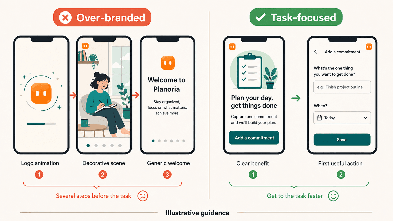
Illustrative onboarding comparison
Over-branded version
- Logo animation
- Full-screen brand statement
- Decorative character scene
- “Welcome to the future of productivity”
- Product task begins several taps later
Task-focused branded version
- Headline: “Plan the commitments already on your plate.”
- Supporting sentence: “Add one client deadline and see the next workable step.”
- Button: “Add a commitment”
- Resulting empty state: “Your week is clear. Add the first commitment.”
The second version still expresses personality through language, illustration, spacing, and color. It gives the user a clear first action.
Apple advises against launch screens used primarily for branding and against unnecessary logo repetition. Apple Branding guidance
Use a repeatable illustration rule
Define a small set of rules:
- Character appears when it clarifies a state or action.
- Illustrations use the same silhouette, palette, and line treatment.
- Decorative elements do not compete with the primary action.
- Animation is short and not required to understand the interface.
- The character does not appear in every empty space simply to increase brand exposure.
A reusable rule can make a small illustration system easier to apply consistently than a collection of disconnected styles.
6. Build consistent store and promotional assets
Separate launch essentials from later promotional work.
Launch essentials
- App icon
- App title and subtitle or short description
- Long description
- Required screenshots
- App previews or promotional video, if used
- Required platform marks or badges
Later promotional assets
- Website or landing page
- Social cards
- Press or partner materials
- Campaign templates
- Additional promotional video
The goal is not to make every asset identical. The goal is to make each asset an adaptation of the same product promise.
| Touchpoint | Adaptation |
|---|---|
| Icon | A simple visual cue for the product category or promise |
| Screenshot 1 | The primary user problem and first useful action |
| Screenshot 2 | A concrete capability |
| Screenshot 3 | A meaningful product moment |
| Website hero | The promise in a clear sentence |
| Social card | One benefit or use case, without unsupported claims |
| Description | Accurate explanation of capabilities and audience |
Apple’s review guidelines address accurate metadata, screenshots, previews, icons, and intellectual-property issues. Its marketing guidance covers badges, product imagery, video, messaging, and use of Apple marks. Apple’s product-page guidance also covers how screenshots, previews, and messaging work together on the listing. Apple App Review Guidelines · Apple Marketing Resources and Identity Guidelines · Creating Your Product Page
Google Play recommends clear, accurate store-listing descriptions and warns against keyword stuffing, unverifiable claims, and misleading references. Its preview-assets guidance covers the listing materials that need to be prepared and localized. Google Play Store Listing best practices · Google Play Preview Assets
Branding and app-store optimization are related but different:
- Branding: Does this feel like the same product everywhere?
- Store optimization: Can the intended audience understand the listing?
- Compliance: Are the claims and assets accurate under the platform’s rules?
Every screenshot should depict a real capability. Every benefit statement should be supportable. Do not promise functionality the app does not contain.
Google Play’s Asset Library supports reuse of icons, screenshots, and feature graphics across listings, experiments, and events. That describes an asset-reuse function; it does not establish a performance benefit. Google Play Asset Library
Before launch, separate three checks that are easy to blur together:
- Brand clarity: Does the listing feel like the same product as the app?
- Store guidance: Does each platform’s current specification allow the asset and presentation?
- Product truth: Does every screenshot, preview, description, and benefit claim match the shipped build?
The linked Apple and Google Play requirements are platform guidance, not permanent rules. Recheck them immediately before submission.
7. Run a first-release brand review
The following minimum viable brand package is editorial guidance, not a platform requirement. Use it as the primary launch tool.
Must ship
- Audience and problem statement
- Differentiator
- One-sentence positioning statement
- Three to five personality traits
- Tone examples and prohibited phrasing
- Name, store-collision, and relevant trademark checks
- Icon concept tested at realistic small sizes
- Light and dark color roles
- Increased-contrast review where supported
- Typography hierarchy
- Shape and spacing rules
- Semantic UI-token mapping
- Rules for errors, success, empty states, and onboarding
- Accurate store title, description, screenshots, and previews
- Platform-specific icon and asset adaptations
- Localization review for intended markets
- Intellectual-property review
Should ship
- Reusable illustration or mascot rules
- Website or landing-page adaptation
- Social-card templates
- Support and notification voice guide
- Shared asset library
- Documentation for future contributors
- A small set of product illustrations
Can wait
- Large illustration libraries
- Extensive motion identity
- Custom marketing campaign system
- Branded merchandise
- Complex logo lockups
- Every possible localization
- A complete brand book for hypothetical future products
Use the checklist as the single launch record for teams. Assign an owner and a status to each item rather than maintaining a second worksheet.
8. Common failure modes and the rebrand path
The examples below are illustrative failure patterns, not measured findings.
| Symptom | Likely cause | Correction | Can wait? |
|---|---|---|---|
| Icon becomes an indistinct blob when reduced | Too many details or weak silhouette | Remove detail and test the primary form at small sizes | No |
| Accent color is unreadable in text or dark mode | Brand palette was treated as a universal value | Map colors to semantic roles and test each theme | No |
| Onboarding feels like an advertisement | Branding was placed ahead of the user’s first task | Explain the workflow and reach a useful action sooner | No |
| Screenshots show unavailable features | Store assets were created before product truth was checked | Audit every screenshot and claim against the shipped build | No |
| Custom font makes labels difficult to scan | Type personality overruled readability | Use the chosen type selectively and preserve a clear hierarchy | No |
| Name resembles an existing app or mark | Clearance started after visual production | Pause, search relevant sources, and seek qualified advice where risk is material | No |
| Logo appears on every screen | Brand visibility was confused with product identity | Let tone, color, type, iconography, and useful moments carry the system | Usually no |
| Android icon breaks under different masks | One flat icon was assumed to fit every launcher | Prepare adaptive layers, safe zones, and themed-icon assets as needed | No |
| Product feels different from its store listing | Store copy and screenshots were written separately | Rebuild both from the same positioning statement | No |
A controlled rebrand sequence
For an existing app, use this dependency order:
- Confirm the new promise, audience, and personality.
- Review the proposed name and intellectual-property risk.
- Create the icon concept and test platform adaptations.
- Update UI tokens, typography, shapes, and key product moments.
- Revise onboarding, empty states, notifications, and support language.
- Update store screenshots, descriptions, previews, website, and social assets.
- Prepare localization and platform-specific versions.
- Communicate the change to existing users.
- Collect recurring questions during the first release cycle. Group them into recognition issues and usability issues, then prioritize fixes that prevent users from identifying the app or completing core tasks.
- Retire old assets only after the new system is available where users need it.
Preserve enough continuity for returning users to recognize the product while making the new direction clear. The exact rollout depends on the scope of the change, release process, and target platforms.
Conclusion: Ship the smallest coherent system
For this guide, consider a first-release brand ready when:
- The audience, problem, and promise are clear.
- The name is usable and has received appropriate review.
- The icon survives realistic size and platform checks.
- Voice, visual rules, and UI tokens agree.
- Product moments and store assets describe real capabilities.
- Accessibility, localization, platform, and intellectual-property checks are complete enough for the intended markets.
You do not need a massive brand book to launch. You need a small system that can be applied consistently and tested honestly.
Start with a short exercise: write the audience, problem, differentiator, and positioning statement. Then ask one person unfamiliar with the app what product experience they expect. If you want a product-specific implementation example, review how MascoFast works and the mascot styles guide, but treat those as optional asset references, not evidence that a mascot improves brand performance.
The Apple, Android, Google Play, and USPTO pages linked above were checked September 19, 2026. Platform policies and specifications can change; recheck the relevant documentation immediately before publication and launch.
Keep exploring
Turn the idea into a usable mascot system, then check the exported animation before it reaches your product.