Daily practice3D Render
Pip the Red Panda
A bright, expressive companion for language learning, daily practice, and friendly progress nudges.
Mobile mascots have to work in tight spaces: app icons, compact onboarding cards, push notifications, and empty states. These examples favor clear silhouettes, readable faces, and simple shapes that survive small-screen use.
Each character is available as a downloadable WebP example under the free project-use license. The collection uses bright silhouettes, large expressions, and distinct animal and symbolic forms that remain readable on small screens.
A bright, expressive companion for language learning, daily practice, and friendly progress nudges.
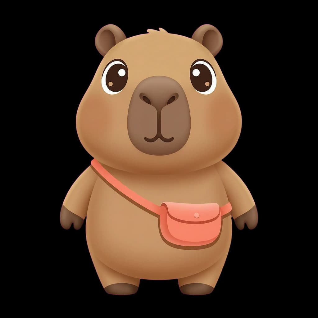
A reassuring character for habit building, gentle reminders, and low-pressure onboarding.

A clever guide for discovery feeds, community features, saved items, and playful exploration.

A high-contrast character for puzzles, quizzes, compact game loops, and quick feedback.

An optimistic companion for travel planning, community updates, and welcoming mobile experiences.

A distinctive non-humanoid form for multitasking, creative tools, and feature-rich mobile products.

A warm, uncomplicated character for wellbeing check-ins, reminders, and calm empty states.

A lively personality for science activities, creative learning, and expressive product moments.

A compact symbolic character for weather, cloud storage, sync status, and lightweight notifications.
Use and modify downloadable gallery assets in personal or commercial apps, websites, games, and marketing. No attribution is required. Do not resell, sublicense, redistribute, or offer the original or substantially unchanged files as standalone assets or asset packs. The assets are non-exclusive and cannot be claimed as trademarks. Read the full Terms before using an asset in a shipped project.
Need one consistent app character?