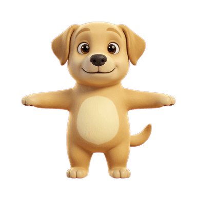
Kids' App Mascot Generator
Character design for a kids' product has its own, well-established visual language: soft rounded shapes, big expressive eyes, and a warm, non-threatening silhouette that reads as instantly friendly to a young audience and to the parents evaluating the app on their behalf. It's the same design logic behind decades of children's media mascots — a character has to communicate "safe and fun" before a child can read a single word of copy.
Create Your MascotWhy a mascot works here
Young children respond to shape and expression long before they process detail or text — soft, rounded forms and large eyes are processed as friendly and safe almost instinctively, which is exactly why so much children's media design converges on the same visual vocabulary. For a learning, entertainment, or parental-control app, a well-designed mascot also does double duty: it reassures the parent making the download decision that the product was actually designed for kids, not just labeled for them.
Best for
- Educational and learning apps wanting a warm guide character for onboarding and lessons
- Kids' games needing a friendly, universally appealing character
- Parental-control or family apps wanting to signal 'built for kids' at a glance
- Story and reading apps wanting a consistent character to narrate or host content
Recommended styles
FAQ
Pixar-style and Kawaii both lean on soft, rounded, warm designs that read as friendly to young audiences; Chibi's oversized-head, tiny-body proportions are especially good for comedic or celebratory moments within a kids' app.